


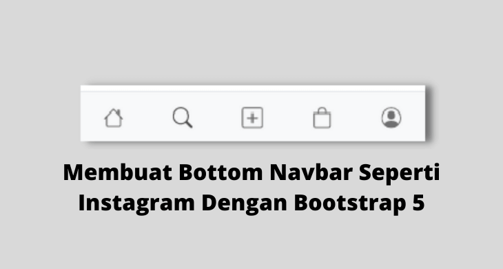
Membuat Bottom Navbar Seperti Instagram Dengan Bootstrap 5
Bootstrap Bottom Navbar - Pada artikel ini saya akan membagikan artikel yang akan membahas tentang bagaimana sih cara membuat bottom navbar seperti instagram atau kebanyakan mobile app dengan bootstrap 5. pada percobaan di artikel ini, kita akan memulai dari nol yaitu dengan membuat file html baru dengan starter template dari bootstrap.
Sebelum lanjut ke langkah-langkah pembuatan bottom navbar dengan bootstrap 5, kita harus tau terlebih dahulu kenapa sih kita perlu membuat bottom navbar web untuk versi mobile ? Jadi, dengan adanya bottom navbar akan memudahkan user untuk berpindah halaman karena posisi navbar dengan jempol user (yang biasanya digunakan untuk menekan) lebih dekat, berbeda jika button navbar berada di pojok atas device seperti kebanyakan web yang ada saat ini, user kesulitan dalam melihat daftar menu navigasi yang ada di website. Keberadaan bottom navbar sangat bagus untuk user experience.
Lalu, kenapa di banyak web belum menerapkan bottom navbar ? tidak semua website harus menerapkan bottom navbar, tergantung target audience dan kebiasaan audience. Kemungkinan, karena target audiencenya adalah user yang sedang mencari tutorial programming yang biasanya kalau orang program, device yang digunakan adalah device yang mempunyai lebar layar large atau lebar seperti laptop, PC dan lain-lain, maka dari itu banyak web masih belum menerapkan bottom navbar, tapi kemungkinan jika saatnya tiba juga akan menerapkan bottom navbar.
Bottom navbar biasa kita jumpai di web atau aplikasi e-commerce, social media seperti twitter, instagram. Nah, pada kesempatan kali ini saya akan mengajak teman-teman belajar bagaimana cara membuat bottom navbar seperti instagram dengan bootstrap versi 5. Baiklah mari kita mulai langkah-langkahnya.
Apa saja yang perlu dipersiapkan ?
- Text editor (Saya menggunakan Visual Studio Code)
- Browser (Saya menggunakan Google Chrome)
- Jaringan Internet (Optional)
Menyiapkan File HTML
Langkah pertama untuk membuat bottom navbar seperti instagram dengan bootstrap adalah kita perlu menyiapkan atau membuat file HTML baru. Silahkan buat file HTML dengan nama file index.html, kemudian copy kode starter bootstrap di bawah ini dan paste pada file HTML yang baru saja dibuat.
<!doctype html>
<html lang="en">
    <head>
        <!-- Required meta tags -->
        <meta charset="utf-8">
        <meta name="viewport" content="width=device-width, initial-scale=1">
        <!-- Bootstrap CSS -->
        <link href="https://cdn.jsdelivr.net/npm/bootstrap@5.0.0-beta3/dist/css/bootstrap.min.css" rel="stylesheet" integrity="sha384-eOJMYsd53ii+scO/bJGFsiCZc+5NDVN2yr8+0RDqr0Ql0h+rP48ckxlpbzKgwra6" crossorigin="anonymous">
        <title>Bottom Navbar - Bisabos</title>
    </head>
    <body>

        <!-- Bootstrap Bundle with Popper -->
        <script src="https://cdn.jsdelivr.net/npm/bootstrap@5.0.0-beta3/dist/js/bootstrap.bundle.min.js" integrity="sha384-JEW9xMcG8R+pH31jmWH6WWP0WintQrMb4s7ZOdauHnUtxwoG2vI5DkLtS3qm9Ekf" crossorigin="anonymous"></script>
    </body>
</html>
Dari kode di atas, kita akan menggunakan bootstrap CSS versi CDN dan bootstrap bundle with popper versi CDN juga. Silahkan save, lalu coba buka di browser. Apa yang ditampilkan ? kosong ? ya memang kita hanya baru membuat starter template, belum membuat tampilannya. Sekarang, silahkan copy kode di bawah ini dan paste di bawah tag <body>.
<nav class="navbar navbar-expand-lg navbar-light bg-light">
            <div class="container-fluid">
                <a class="navbar-brand" href="#">Navbar</a>
                <button class="navbar-toggler" type="button" data-bs-toggle="collapse" data-bs-target="#navbarSupportedContent" aria-controls="navbarSupportedContent" aria-expanded="false" aria-label="Toggle navigation">
                <span class="navbar-toggler-icon"></span>
                </button>
                <div class="collapse navbar-collapse" id="navbarSupportedContent">
                    <ul class="navbar-nav me-auto mb-2 mb-lg-0">
                        <li class="nav-item">
                            <a class="nav-link active" aria-current="page" href="#">Home</a>
                        </li>
                        <li class="nav-item">
                            <a class="nav-link" href="#">Link</a>
                        </li>
                        <li class="nav-item dropdown">
                            <a class="nav-link dropdown-toggle" href="#" id="navbarDropdown" role="button" data-bs-toggle="dropdown" aria-expanded="false">
                            Dropdown
                            </a>
                            <ul class="dropdown-menu" aria-labelledby="navbarDropdown">
                                <li><a class="dropdown-item" href="#">Action</a></li>
                                <li><a class="dropdown-item" href="#">Another action</a></li>
                                <li>
                                    <hr class="dropdown-divider">
                                </li>
                                <li><a class="dropdown-item" href="#">Something else here</a></li>
                            </ul>
                        </li>
                        <li class="nav-item">
                            <a class="nav-link disabled" href="#" tabindex="-1" aria-disabled="true">Disabled</a>
                        </li>
                    </ul>
                    <form class="d-flex">
                        <input class="form-control me-2" type="search" placeholder="Search" aria-label="Search">
                        <button class="btn btn-outline-success" type="submit">Search</button>
                    </form>
                </div>
            </div>
        </nav>
Dengan kode di atas, sekarang kita sudah mempunyai tampilan navbar namun ketika pada layar kecil navbar masih di posisi atas seperti pada gambar di bawah ini.
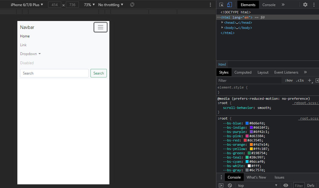
Agar ketika layar berukuran kecil navbar tidak ditampilkan, kita perlu manambahkan class d-none d-lg-block pada tag navbar yang artinya top navbar akan disembunyikan disemua ukuran layar kecuali pada layar berukuran besar atau large. Sekarang tag navbar kita akan menjadi seperti contoh di bawah ini.
<nav class="navbar navbar-expand-lg navbar-light bg-light d-none d-lg-block">Sekarang coba save dan buka pada browser dengan ukuran layar mobile, maka navbar sudah tidak ditampilkan lagi. Kemudian bagaimana cara agar navbar tampil di bawah ? nah, sekarang coba copy code di bawah ini dan paste tepat di bawah tag </nav> yang sudah dibuat sebelumnya.
<!-- Bottom Navbar -->
        <nav class="navbar navbar-light bg-light border-top navbar-expand d-md-none d-lg-none d-xl-none fixed-bottom">
            <ul class="navbar-nav nav-justified w-100">
                <li class="nav-item">
                    <a href="#" class="nav-link">
                       Home
                    </a>
                </li>
                <li class="nav-item">
                    <a href="#" class="nav-link">
                       Search
                    </a>
                </li>
                <li class="nav-item">
                    <a href="#" class="nav-link">
                        Add
                    </a>
                </li>
                <li class="nav-item">
                    <a href="#" class="nav-link">
                        Shop
                    </a>
                </li>
                <li class="nav-item">
                    <a href="#" class="nav-link">
                       Profile
                    </a>
                </li>
            </ul>
        </nav>
Perlu diperhatikan pada kode bottom navbar di atas, kita menambahkan class border-top, navbar-expand, d-md-none, d-lg-none, d-xl-none, fixed-bottom, class-class tersebut fungsinya apa ? mari simak penjelasannya pada tabel di bawah ini.
| Class | Fungsi |
|---|---|
| border-top | Untuk memberikan efek garis atas pada navbar |
| navbar-expand | Mengatur agar tampilan navbar melebar, bukan ke bawah. |
| d-md-none | Sembunyikan pada layar berukuran medium |
| d-lg-none | Sembunyikan pada layar berukuran large |
| d-xl-none | Sembunyikan pada layar berukuran extra large |
| fixed-bottom | Menampilkan tetap di bawah |

Coba save dari perubahan yang telah dilakukan tadi dan coba lihat di browser dengan ukuran small atau kecil, maka tampilannya akan seperti gambar di atas. Oke, dengan ukuran layar kecil, top navbar sudah disembunyikan dan bottom navbar di tampilkan. Menu-menu di bottom navbar masih berupa teks, kita inginya menu navbar berupa icon seperti di instagram, apa solusinya ? Coba kunjungi di icon.getbootstrap.com, kemudian cari kata kunci misalnya home.
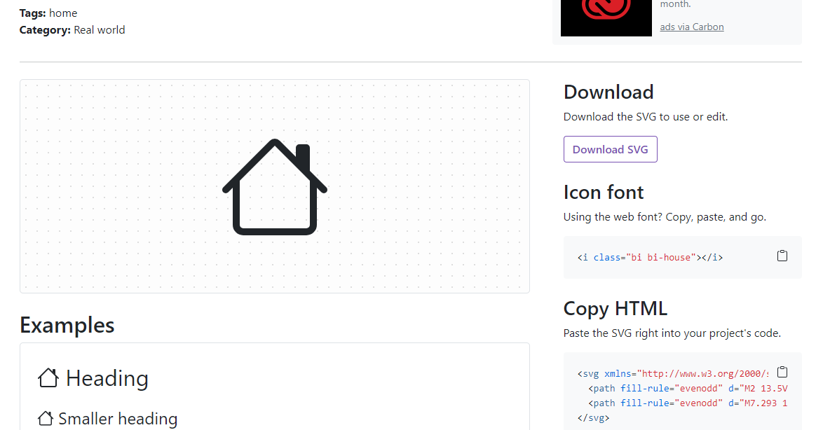
Nah, nanti terdapat icon seperti gambar di atas, klik kemudian copy HTML atau svg karena kita akan menggunakan opsi svg (bukan icon). Buka file HTML lagi, dan paste kode svg tersebut menggantikan menu Home di section bottom navbar. Lakukan lagi dengan mencari icon untuk search, add, shop dan profile. Secara keseluruhan, nantinya kode bottom navbar akan seperti di bawah ini.
<nav class="navbar navbar-light bg-light border-top navbar-expand d-md-none d-lg-none d-xl-none fixed-bottom">
            <ul class="navbar-nav nav-justified w-100">
                <li class="nav-item">
                    <a href="#" class="nav-link">
                        <svg xmlns="http://www.w3.org/2000/svg" width="1.5em" height="1.5em" fill="currentColor" class="bi bi-house" viewBox="0 0 16 16">
                            <path fill-rule="evenodd" d="M2 13.5V7h1v6.5a.5.5 0 0 0 .5.5h9a.5.5 0 0 0 .5-.5V7h1v6.5a1.5 1.5 0 0 1-1.5 1.5h-9A1.5 1.5 0 0 1 2 13.5zm11-11V6l-2-2V2.5a.5.5 0 0 1 .5-.5h1a.5.5 0 0 1 .5.5z"/>
                            <path fill-rule="evenodd" d="M7.293 1.5a1 1 0 0 1 1.414 0l6.647 6.646a.5.5 0 0 1-.708.708L8 2.207 1.354 8.854a.5.5 0 1 1-.708-.708L7.293 1.5z"/>
                        </svg>
                    </a>
                </li>
                <li class="nav-item">
                    <a href="#" class="nav-link">
                        <svg xmlns="http://www.w3.org/2000/svg" width="1.5em" height="1.5em" fill="currentColor" class="bi bi-search" viewBox="0 0 16 16">
                            <path d="M11.742 10.344a6.5 6.5 0 1 0-1.397 1.398h-.001c.03.04.062.078.098.115l3.85 3.85a1 1 0 0 0 1.415-1.414l-3.85-3.85a1.007 1.007 0 0 0-.115-.1zM12 6.5a5.5 5.5 0 1 1-11 0 5.5 5.5 0 0 1 11 0z"/>
                        </svg>
                    </a>
                </li>
                <li class="nav-item">
                    <a href="#" class="nav-link">
                        <svg xmlns="http://www.w3.org/2000/svg" width="1.5em" height="1.5em" fill="currentColor" class="bi bi-plus-square" viewBox="0 0 16 16">
                            <path d="M14 1a1 1 0 0 1 1 1v12a1 1 0 0 1-1 1H2a1 1 0 0 1-1-1V2a1 1 0 0 1 1-1h12zM2 0a2 2 0 0 0-2 2v12a2 2 0 0 0 2 2h12a2 2 0 0 0 2-2V2a2 2 0 0 0-2-2H2z"/>
                            <path d="M8 4a.5.5 0 0 1 .5.5v3h3a.5.5 0 0 1 0 1h-3v3a.5.5 0 0 1-1 0v-3h-3a.5.5 0 0 1 0-1h3v-3A.5.5 0 0 1 8 4z"/>
                        </svg>
                    </a>
                </li>
                <li class="nav-item">
                    <a href="#" class="nav-link">
                        <svg xmlns="http://www.w3.org/2000/svg" width="1.5em" height="1.5em" fill="currentColor" class="bi bi-bag" viewBox="0 0 16 16">
                            <path d="M8 1a2.5 2.5 0 0 1 2.5 2.5V4h-5v-.5A2.5 2.5 0 0 1 8 1zm3.5 3v-.5a3.5 3.5 0 1 0-7 0V4H1v10a2 2 0 0 0 2 2h10a2 2 0 0 0 2-2V4h-3.5zM2 5h12v9a1 1 0 0 1-1 1H3a1 1 0 0 1-1-1V5z"/>
                        </svg>
                    </a>
                </li>
                <li class="nav-item">
                    <a href="#" class="nav-link">
                        <svg xmlns="http://www.w3.org/2000/svg" width="1.5em" height="1.5em" fill="currentColor" class="bi bi-person-circle" viewBox="0 0 16 16">
                            <path d="M11 6a3 3 0 1 1-6 0 3 3 0 0 1 6 0z"/>
                            <path fill-rule="evenodd" d="M0 8a8 8 0 1 1 16 0A8 8 0 0 1 0 8zm8-7a7 7 0 0 0-5.468 11.37C3.242 11.226 4.805 10 8 10s4.757 1.225 5.468 2.37A7 7 0 0 0 8 1z"/>
                        </svg>
                    </a>
                </li>
            </ul>
        </nav>
Dengan kode di atas, kita sudah mengubah semua text menu yang ada di bottom navbar dengan icon seperti di instagram menggunakan icon dari bootstrap. Dengan kode di atas, maka tampilan menu atau bottom navbar kita akan menjadi seperti gambar di bawah ini.
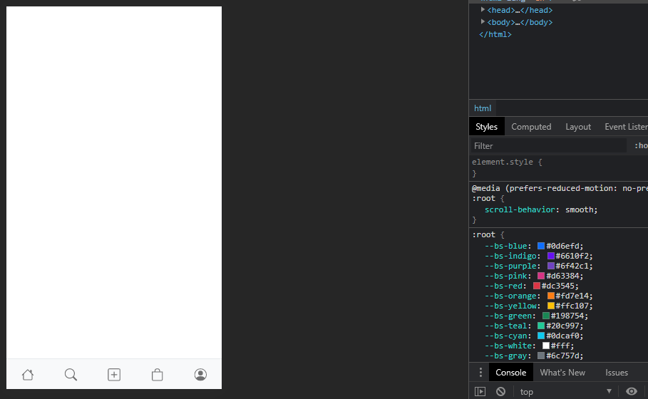
Gimana ? sudah terlihat mirip dengan menu atau bottom navbar di instagram kan ? tinggal menambahkan contoh konten saja agar tidak terlihat kosong. Silahkan copy kode di bawah ini, kemudian paste di bawah tag </nav> atau di atas tag <script>
<!-- Content -->
        <div class="container">
            <div class="row">
                <div class="clearfix py-4">
                    <img src="cover.png" class="col-lg-6 float-md-end mb-3 ms-md-3 img-thumbnail img-fluid" alt="...">
                    <p>
                        A paragraph of placeholder text. We're using it here to show the use of the clearfix class. We're adding quite a few meaningless phrases here to demonstrate how the columns interact here with the floated image.
                    </p>
                    <p>
                        As you can see the paragraphs gracefully wrap around the floated image. Now imagine how this would look with some actual content in here, rather than just this boring placeholder text that goes on and on, but actually conveys no tangible information at. It simply takes up space and should not really be read.
                    </p>
                    <p>
                        And yet, here you are, still persevering in reading this placeholder text, hoping for some more insights, or some hidden easter egg of content. A joke, perhaps. Unfortunately, there's none of that here.
                    </p>
                </div>
            </div>
        </div>
Dengan menambahkan kode di atas, maka sekarang tampilan projek latihan membuat bottom navbar seperti instagram dengan bootstrap akan menjadi seperti gambar di bawah ini.

kode lengkap Index.html
<!doctype html>
<html lang="en">
    <head>
        <!-- Required meta tags -->
        <meta charset="utf-8">
        <meta name="viewport" content="width=device-width, initial-scale=1">
        <!-- Bootstrap CSS -->
        <link href="https://cdn.jsdelivr.net/npm/bootstrap@5.0.0-beta3/dist/css/bootstrap.min.css" rel="stylesheet" integrity="sha384-eOJMYsd53ii+scO/bJGFsiCZc+5NDVN2yr8+0RDqr0Ql0h+rP48ckxlpbzKgwra6" crossorigin="anonymous">
        <title>Bisabos</title>
    </head>
    <body>
        <nav class="navbar navbar-expand-lg navbar-light d-none d-lg-block bg-light">
            <div class="container-fluid">
                <a class="navbar-brand" href="#">Navbar</a>
                <button class="navbar-toggler" type="button" data-bs-toggle="collapse" data-bs-target="#navbarSupportedContent" aria-controls="navbarSupportedContent" aria-expanded="false" aria-label="Toggle navigation">
                <span class="navbar-toggler-icon"></span>
                </button>
                <div class="collapse navbar-collapse" id="navbarSupportedContent">
                    <ul class="navbar-nav me-auto mb-2 mb-lg-0">
                        <li class="nav-item">
                            <a class="nav-link active" aria-current="page" href="#">Home</a>
                        </li>
                        <li class="nav-item">
                            <a class="nav-link" href="#">Link</a>
                        </li>
                        <li class="nav-item dropdown">
                            <a class="nav-link dropdown-toggle" href="#" id="navbarDropdown" role="button" data-bs-toggle="dropdown" aria-expanded="false">
                            Dropdown
                            </a>
                            <ul class="dropdown-menu" aria-labelledby="navbarDropdown">
                                <li><a class="dropdown-item" href="#">Action</a></li>
                                <li><a class="dropdown-item" href="#">Another action</a></li>
                                <li>
                                    <hr class="dropdown-divider">
                                </li>
                                <li><a class="dropdown-item" href="#">Something else here</a></li>
                            </ul>
                        </li>
                        <li class="nav-item">
                            <a class="nav-link disabled" href="#" tabindex="-1" aria-disabled="true">Disabled</a>
                        </li>
                    </ul>
                    <form class="d-flex">
                        <input class="form-control me-2" type="search" placeholder="Search" aria-label="Search">
                        <button class="btn btn-outline-success" type="submit">Search</button>
                    </form>
                </div>
            </div>
        </nav>
        <!-- Bottom Navbar -->
        <nav class="navbar navbar-light bg-light border-top navbar-expand d-md-none d-lg-none d-xl-none fixed-bottom">
            <ul class="navbar-nav nav-justified w-100">
                <li class="nav-item">
                    <a href="#" class="nav-link">
                        <svg xmlns="http://www.w3.org/2000/svg" width="1.5em" height="1.5em" fill="currentColor" class="bi bi-house" viewBox="0 0 16 16">
                            <path fill-rule="evenodd" d="M2 13.5V7h1v6.5a.5.5 0 0 0 .5.5h9a.5.5 0 0 0 .5-.5V7h1v6.5a1.5 1.5 0 0 1-1.5 1.5h-9A1.5 1.5 0 0 1 2 13.5zm11-11V6l-2-2V2.5a.5.5 0 0 1 .5-.5h1a.5.5 0 0 1 .5.5z"/>
                            <path fill-rule="evenodd" d="M7.293 1.5a1 1 0 0 1 1.414 0l6.647 6.646a.5.5 0 0 1-.708.708L8 2.207 1.354 8.854a.5.5 0 1 1-.708-.708L7.293 1.5z"/>
                        </svg>
                    </a>
                </li>
                <li class="nav-item">
                    <a href="#" class="nav-link">
                        <svg xmlns="http://www.w3.org/2000/svg" width="1.5em" height="1.5em" fill="currentColor" class="bi bi-search" viewBox="0 0 16 16">
                            <path d="M11.742 10.344a6.5 6.5 0 1 0-1.397 1.398h-.001c.03.04.062.078.098.115l3.85 3.85a1 1 0 0 0 1.415-1.414l-3.85-3.85a1.007 1.007 0 0 0-.115-.1zM12 6.5a5.5 5.5 0 1 1-11 0 5.5 5.5 0 0 1 11 0z"/>
                        </svg>
                    </a>
                </li>
                <li class="nav-item">
                    <a href="#" class="nav-link">
                        <svg xmlns="http://www.w3.org/2000/svg" width="1.5em" height="1.5em" fill="currentColor" class="bi bi-plus-square" viewBox="0 0 16 16">
                            <path d="M14 1a1 1 0 0 1 1 1v12a1 1 0 0 1-1 1H2a1 1 0 0 1-1-1V2a1 1 0 0 1 1-1h12zM2 0a2 2 0 0 0-2 2v12a2 2 0 0 0 2 2h12a2 2 0 0 0 2-2V2a2 2 0 0 0-2-2H2z"/>
                            <path d="M8 4a.5.5 0 0 1 .5.5v3h3a.5.5 0 0 1 0 1h-3v3a.5.5 0 0 1-1 0v-3h-3a.5.5 0 0 1 0-1h3v-3A.5.5 0 0 1 8 4z"/>
                        </svg>
                    </a>
                </li>
                <li class="nav-item">
                    <a href="#" class="nav-link">
                        <svg xmlns="http://www.w3.org/2000/svg" width="1.5em" height="1.5em" fill="currentColor" class="bi bi-bag" viewBox="0 0 16 16">
                            <path d="M8 1a2.5 2.5 0 0 1 2.5 2.5V4h-5v-.5A2.5 2.5 0 0 1 8 1zm3.5 3v-.5a3.5 3.5 0 1 0-7 0V4H1v10a2 2 0 0 0 2 2h10a2 2 0 0 0 2-2V4h-3.5zM2 5h12v9a1 1 0 0 1-1 1H3a1 1 0 0 1-1-1V5z"/>
                        </svg>
                    </a>
                </li>
                <li class="nav-item">
                    <a href="#" class="nav-link">
                        <svg xmlns="http://www.w3.org/2000/svg" width="1.5em" height="1.5em" fill="currentColor" class="bi bi-person-circle" viewBox="0 0 16 16">
                            <path d="M11 6a3 3 0 1 1-6 0 3 3 0 0 1 6 0z"/>
                            <path fill-rule="evenodd" d="M0 8a8 8 0 1 1 16 0A8 8 0 0 1 0 8zm8-7a7 7 0 0 0-5.468 11.37C3.242 11.226 4.805 10 8 10s4.757 1.225 5.468 2.37A7 7 0 0 0 8 1z"/>
                        </svg>
                    </a>
                </li>
            </ul>
        </nav>
        <!-- Content -->
        <div class="container">
            <div class="row">
                <div class="clearfix py-4">
                    <img src="cover.png" class="col-lg-6 float-md-end mb-3 ms-md-3 img-thumbnail img-fluid" alt="...">
                    <p>
                        A paragraph of placeholder text. We're using it here to show the use of the clearfix class. We're adding quite a few meaningless phrases here to demonstrate how the columns interact here with the floated image.
                    </p>
                    <p>
                        As you can see the paragraphs gracefully wrap around the floated image. Now imagine how this would look with some actual content in here, rather than just this boring placeholder text that goes on and on, but actually conveys no tangible information at. It simply takes up space and should not really be read.
                    </p>
                    <p>
                        And yet, here you are, still persevering in reading this placeholder text, hoping for some more insights, or some hidden easter egg of content. A joke, perhaps. Unfortunately, there's none of that here.
                    </p>
                </div>
            </div>
        </div>
        <!-- Bootstrap Bundle with Popper -->
        <script src="https://cdn.jsdelivr.net/npm/bootstrap@5.0.0-beta3/dist/js/bootstrap.bundle.min.js" integrity="sha384-JEW9xMcG8R+pH31jmWH6WWP0WintQrMb4s7ZOdauHnUtxwoG2vI5DkLtS3qm9Ekf" crossorigin="anonymous"></script>
    </body>
</html>
Secara keseluruhan kode yang telah kita buat pada latihan membuat menu atau bottom navbar pada tampilan mobile seperti instagram dengan bootstrap 5 bisa dilihat pada kode di atas.
Sekian artikel kali ini, sampai disini kita sudah berhasil menyelesaikan atau membuat menu bottom navbar seperti di instagram dengan bootstrap 5. Silahkan teman-teman modifikasi atau improvisasi sesuai dengan keinginan atau kebutuhan teman. Jika ada saran, kritik, masukan atau apapun itu yang ingin didiskusikan, silahkan tulis komentar di bawah ini.
Sampai jumpa di artikel berikutnya. 😉
- Cara Mengatasi Error XAMPP: MySQL shutdown unexpectedly 23 Oktober 2021 68170 views
- Tutorial CRUD (Create, Read, Update & Delete) Codeigniter 4 dengan Bootstrap 14 Oktober 2021 33620 views
- Laravel 8: REST API Authentication dengan Sanctum 17 September 2021 32640 views
- Membuat REST API CRUD di Laravel 8 dengan Sanctum 18 September 2021 28828 views
- Contoh Cara Menggunakan Sweet Alert di Laravel 8 27 Agustus 2021 28195 views
 Facebook
  Whatsapp
  Twitter
  Telegram